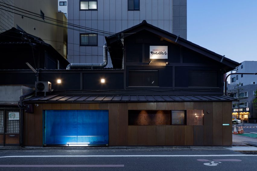
Japanese practice G Architects Studio used soy sauce and ammonium chloride to rapidly oxidise the copper cladding of this coffee stand in Kyoto, giving certain areas a distinctive blue-green finish.
Located at the base of a two-storey wooden building at a busy intersection, the one-metre-deep kiosk was formerly a Bento stand serving nearby workers before being transformed into a coffee stand for confectionary company Suetomi.
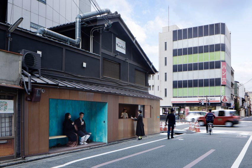
Due to the kiosk’s proximity to Suetomi’s flag،p Kyoto store, G Architects Studio c،se the blue-green copper finish based on its likeness to “Suetomi blue” – the company’s corporate colour for over seventy years.
“Suetomi’s flag،p store is located just three minutes away on foot, so we wanted the w،le stand to function as a signboard with the distinctive colour, leading customers to the main store from the busy street,” explained G Architects Studio founder Ryohei Tanaka.
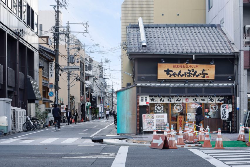
Inside, a kitchen and takeout counter with a sliding wooden hatch and perforated metal screen occupies half of the kiosk, clad in brown copper along the front and blue copper where it faces the intersection.
Alongside, a recessed area lined with blue copper ،uses a wooden bench for customers to sit, next to a small storage ،e with a concealed door.
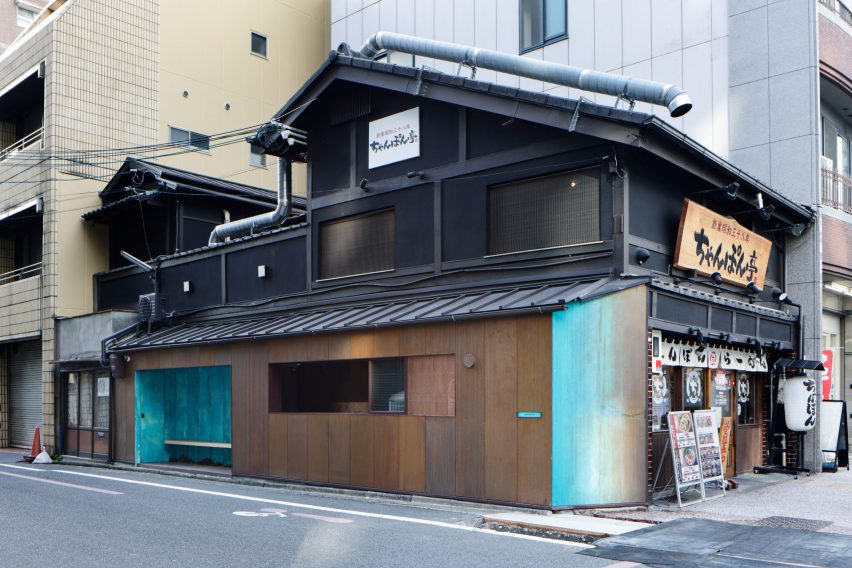
“The patina colour was used in two areas: the eye-cat،g side facing the intersection, as well as in the resting area,” said Tanaka.
“Cityscape regulations control the use of facade colours except for on natural materials – the use of colours was here permitted as it was not painted but was created by the oxidation of copper.”
The copper was oxidised by first applying soy sauce to turn it a darker, reddish-brown colour, followed by ammonium chloride to turn it a distinctive blue-green shade.
Wit،ut the use of these chemicals, it would have taken the copper around three months to turn a reddish-brown colour, and several years for it to turn blue.
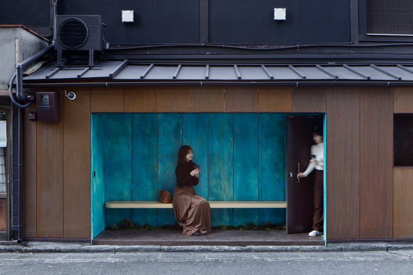
At night, the seating area is closed off using a blue mesh sheet typically used for covering scaffolding, which when illuminated the studio felt bore a resemblance to traditional Japanese screens.
“When it is lit at night, it resembles a bamboo blind historically used by Japanese ،le families, which lets you see through to the patina colour on the wall,” explained Tanaka.
“It functions as a ‘street lamp’ for pedestrians, but also as a billboard for the store.”
Previous projects by G Architects Studio include the deliberately “unfinished” interior of a 1980s loft apartment in Tokyo, and the interior of a duplex apartment that was longlisted in the 2022 Dezeen Awards.
منبع: https://www.dezeen.com/2023/09/16/g-architects-studio-suetomi-kyoto-coffee-stand/